A Social Network of Carleton College in the 1890s
Today we are going to try out a real-world network analysis project and attempt to reconstruct the social network of Carleton College around its 25th anniversary in 1891. The school was small enough at that time that everyone probably knew everyone else, and we cannot interview people to ask who their friends were. Of course, Facebook didn’t exist in 1891, so we can’t easily download a list of friends to start exploring (but if you want to know how to do that you can check out this tutorial for using netvizz and Gephi to map your Facebook network).
 So how are we going to construct an historical social network? Well, fortunately, the Algol Yearbook was first published in 1890 and all issues since have been digitized by our helpful librarians and made available through the library catalog. The yearbooks won’t exactly tell us who was friends with whom, but they do list the complete class lists for a given year (providing all the individuals that will be the nodes in our network) and also all of the organizations on campus with their member lists. We can assume that people who belonged to the same organization interacted regularly and construct relationships (the edges of our network) based on these affiliations.
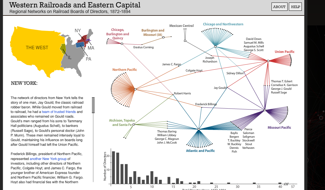
This is called an affiliation network and can be a powerful way of exploring connections and influence, as illustrated by the graph of regional networks of railroad directors below. Ours will allow us to construct a bimodal network graph of individuals and organizations in Carleton’s early history, from which we can derive a one-mode network of connected individuals based on their co-membership in these clubs. The result should allow us to ascertain who were the most central individuals at Carleton that year, who formed bridges between different communities and other useful network metrics.
There are many sophisticated ways to perform this type of analysis (here’s a good Stanford tutorial on doing so with R), but we are hackers here and are going to use easy, off-the-shelf tools: Microsoft Excel to collect our data and the free NodeXL template to visualize the network. Once we have our data, we’ll also be able to export it to Gephi and do some fancy visualizations and analyses there.
Exercise: Data Collection
First, we need to extract the lists of students and their membership affiliations from the yearbook. The volumes were OCRd, but the process is far from perfect, making automatic data extraction pretty impossible. We will need to do a good amount of copy/pasting and hand editing to get these lists into shape.
- Go to the 1891 Algol in the Carleton Digital Collections and explore the item
- The interface allows us to view the PDF images and the scanned text
- Go to page 28-29 which lists the Senior Class, and click the View PDF & Text button to see what I mean about the data quality
- The original includes a table in landscape orientation on the facing page that was scanned as a two-page spread which caused the OCR to freak out. So we’ll need to do this the old fashioned way with copy/pasting
- With your group, pick one of the first five issues of the Algol, download the PDF to your computer and open it in Adobe Acrobat
- Go to the senior class list, highlight the text and right click it.
- Acrobat tries to distinguish tabular data from raw text, and might let you copy as a table or open directly as a CSV.
- If it works, great! But it probably won’t.
- Go to the senior class list, highlight the text and right click it.
- Create a new Microsoft Excel spreadsheet
- Give the first four columns the following headings
- Name
- Organization
- Class Year
- Yearbook
- Copy as much of the class list as you can at once from the PDF and paste it in the name column
- Give the first four columns the following headings
- Clean the data so that you are left with one column containing a student name in each row
- You might find Excel’s Text to Columns wizard helpful, or if you have a text editor that can handle regular expressions you could do a find/replace swapping out something like
\.\s(a period followed by whitespace) for
\n(a new line, or carriage return). - The result should be a single column containing the names (and only the names) of the senior class
- You might find Excel’s Text to Columns wizard helpful, or if you have a text editor that can handle regular expressions you could do a find/replace swapping out something like
- Fill out the Class Year and Yearbook values for each,
- e.g. for the 1891 issue, Yearbook = 1891 for all names and Class Year = 1890 for the Seniors
- Repeat the process for the junior, sophomore and freshman classes
- Adding their names below the seniors and filling in the appropriate values for the rest
- Now collect the organization information
- Create a new sheet called “Orgs” with two columns, Name and Organization
- For each organization that has a printed member list
- Copy and paste the member list as above into the Name column
- Then input the organization name in the Organization column
- Data Cleaning
- Since the yearbook compilers were not thinking in terms of machine compatibility, they often recorded names differently in different lists,
- e.g. “Hannah M. Griffith” in the class list might show up as “Griffith, H.M.” in a member list.
- To make our graph meaningful we need to create an Index of Persons from the Index of Names we just created.
- This is a standard step in prosopographical research (that is, research on a group of named individuals). For an example of a major DH project underway to distinguish persons from names in the ancient world, see the SNAP:DRGN project.
- To do this properly, we would construct a database with unique IDs for each name, linked as foreign keys to a new table listing unique persons, along with new fields describing the rationale for our decisions.
- We don’t have the time for that in this project, so we are just going to assume that if the initials match, we have the same person
- We will use our class list as the Index of Persons, since each are only listed once, and replace the non-standard names in the orgs list with those
- Sort your Orgs sheet alphabetically by name to put all the similar names together.
- Go through the list of names, and replace each instance with its equivalent from the Class list
- For example, for Griffith, H.M. you would search the class list for Griffith, copy “Hannah M. Griffith” to the clipboard, then paste it the Org list, replacing any relevant records
- Repeat until cleaned
- Resort the list based on Organization
- Go through the list of names, and replace each instance with its equivalent from the Class list
- Since the yearbook compilers were not thinking in terms of machine compatibility, they often recorded names differently in different lists,
Exercise: Affiliation Network in NodeXL
NodeXL is a free extension that gives Excel the functionality of a network analysis program, allowing you to store, analyze and visualize networks. See this detailed introductory tutorial by Derek Hanson and Ben Schneiderman will give you a step by step guide to using the program. The Serious Eats Analysis section beginning on page 27 provides an example of working with bimodal data like ours.
Now that we have all of the yearbook data collected in our sheet, we need to turn it into a format that NodeXL can read. The simplest of these is an edge list, which consists of two columns containing the node names, where each row is an edge connecting those two vertices.
The Orgs sheet you created above will be our edge list, which we can use to make a bimodal display of our affiliation network data in NodeXL.

- Download and install NodeXL from this site
- Follow the installation instructions and launch a blank template
- NB: You may run into errors with the latest build. If so, try an earlier version of the “NodeXL Excel Template” under Other Downloads
- You should now have a form to begin filling in, and a new NodeXL ribbon of tools at the top of the Excel window (like the image above).
- Follow the installation instructions and launch a blank template
- Copy and paste the edge list of all your people and organizations into the Edges tab’s first two Vertex Columns
- Follow the instructions in the tutorial linked above to generate a graph, add styling, change the layout and experiment with visualizing a multimodal network
- For Layout, try the Harel-Koren Fast Multiscale option
- Follow the instructions in the tutorial linked above to generate a graph, add styling, change the layout and experiment with visualizing a multimodal network
What insights can you glean from this visualization? Is it helpful to see the affiliations in this way? Do any individuals or organizations stand out as particularly isolated or well connected?
Exercise: Person-to-Person Network
We are not just interested in the indirect connections through affiliations, however, we also want to see how co-membership creates direct connection between people. In order to transform our bimodal network into a person-to-person unimodal one we need to turn this edge list into a matrix. A network can be represented as a binary matrix wherein a connection is indicated by a 1 and no connection receives a 0. The following two tables represent the same network information, showing directed relationships between Nodes 1 and 2 (note that Alice’s row contains all 0s, since she never appears in the Node 1 list).

To get a matrix like this for our data, we would put the Organizations along the top axis, and enter 1s wherever people were members and zeroes everywhere else. Doing this by hand for a large dataset would be very time consuming. Statistical packages like R have functions that will do these transformations for you, but it can also be done using Excel’s Pivot Table feature to generate the person-to-affiliation matrix and the SumProduct function on the result to connect people to people based on the number of organizations they both attended.
If you want a model download the excel file below to see how everything listed below works together.
- Put your cursor in the data range for your edge list and select Pivot Table from the Insert or Data menu
- Drag the field names into the areas indicated in the image, so that Names label Rows, Organizations label Columns,
- Then drag Organizations into Values as well, so that Count of Organization fills in the matrix.
- The result should like like that below

- Now we need to transform this into a unimodal network
- Copy the names (and only the names) from the Pivot Table into a new empty column to the right of the Pivot Table
- Click in the cell above and to the right of the top name (the first cell of the column headings), choose Edit > Paste Special… and check the Transpose box to copy the same list across instead of down

- You should now have an empty matrix with names across both axes
To fill this grid, we need to use some advanced Excel features: named ranges, and nested formulas. The formula we will be using is complex and looks like this:
=IF($G2<>H$1,SUMPRODUCT(OFFSET(matrix,MATCH($G2,names,0)-1,0,1,COLUMNS(matrix)),OFFSET(matrix,MATCH(H$1,names,0)-1,0,1,COLUMNS(matrix))),0)
I will try to break it down a bit. If you don’t care about how this works, feel free to skip this section!
- The main component is SUMPRODUCT, which will take as input two rows of our person-to-affiliation matrix, multiplying each set of values together and adding the results. 1X0 or 0x0 gives us a 0, but wherever we have two ones in the same column (i.e. the people in those rows belonged to the same group) 1×1 = 1.
- If the two people attended multiple groups, those 1s are added together, giving us a weighted value in our new matrix: 1s for one co-membership, 0s for none, and higher number for multiples.
- SUMPRODUCT takes two ranges as inputs, and to select them we have two OFFSET functions
- OFFSET(reference,rows,cols,height,width)
- This looks in a range of cells (reference), starting a certain number of rows (rows), and columns (cols) away from the reference point, and returns a selected range of (height) and (width) cells.
- In our example, the reference is the named range “matrix”, which will return a range 1 row high and the width of our “matrix” range (COLUMNS(matrix)). The number of rows is provided by the output of another function
- MATCH(lookup_value,lookup_array,match_type)
- This returns the position of the “lookup_value” in “lookup_array”, which in our case is matching the name in the current row in our new matrix ($G2 in the example above)
- MATCH(lookup_value,lookup_array,match_type)
- The second OFFSET is identical to the first, except it will match against the name in the current column of our matrix (H$1) above
- OFFSET(reference,rows,cols,height,width)
- Finally, we wrap the whole thing in an IF function
- IF(logical_test,value_if_true,value_if_false)
- This makes sure the names in the current row and column are not equal to each other ($G2<>H$1), and runs the function only if true, otherwise returning a 0
- Why? Because otherwise we would get very high values across the diagonal since each person obviously shared membership with themselves in each group they belonged to!
Phew! Got all that? It’s a lot, I know, but if you name the ranges correctly and set the values for your first cell, you should be able to copy the formula into the rest of the blank cells and Hey Presto! a weighted person-to-person matrix should appear.
- Name your ranges so that the formula will work
- In your Matrix sheet, select the binary values (omitting the Grand Totals!)
- Put your cursor in the name field at top left and type “matrix” then hit return

- Put your cursor in the name field at top left and type “matrix” then hit return
- Select the list of names (omitting the Row Labels and Grand Total)
- Put your cursor back in the name field and type “names” then hit return

- Put your cursor back in the name field and type “names” then hit return
- In your Matrix sheet, select the binary values (omitting the Grand Totals!)
- Almost there! Now for the formula
- Copy the full formula above
- Double click in the top left cell of your blank person-to-person matrix and paste the formula
- Before you hit return
- You need to change the values of $G2 and H$1 to select the first names on each axis

- In my example, I would need to change BOTH $G2s to $F4s, and BOTH H$1s to G$3s
- Make sure you keep the dollar signs in place, so that the labels remain selected
- In my example, I would need to change BOTH $G2s to $F4s, and BOTH H$1s to G$3s
- You need to change the values of $G2 and H$1 to select the first names on each axis
- Copy the cell you just entered the formula in and paste it in the rest of the range and you should see all the values magically populate
- Finally, we can output this matrix as a csv file and import it into NodeXL
- Copy the whole matrix you just created including labels (e.g. F3:J7 above)
- Add a new sheet called CSV
- Click cell A1
- Edit > Paste Special…
- Click on the Values radio button and hit OK
- Got to File > Save As
- Choose Format: Comma Separated Values (.csv)
- Copy the whole matrix you just created including labels (e.g. F3:J7 above)
We are finally ready to load the person-to-person matrix you created above into NodeXL
- Go to NodeXL > Import > From Open Matrix Workbook… and import the csv file you just made
- Generate a graph and explore visualization options.
You did it! Give yourself a pat on the back. That was hard work.